This blog is generated with Octopress. While I was happy using Octopress more or less out-of-the-box for my Hacker School blog, I wanted a bit more control over the layout for this one.
As this helpful blog post points out, your available themes reside in a .themes subdirectory of Octopress. A theme consists of information for the Liquid template engine to generate the HTML pages (in layouts) and for Sass to generate a CSS stylesheet (in sass). When you install a theme (rake install[themename]), those files are copied over into the corresponding parts of your Octopress source and sass directories. When you are working on a new theme, you fiddle with the files right in source and sass and later bundle it up, drop it in .themes, and install it. (And of course, you can always reset by re-installing the “Classic” theme.)
layouts is your chance to add, rearrange, or remove entire elements. I didn’t care about a lot of the social media hooks, and I wanted to simplify the structure of the HTML to make the CSS easier, so I ripped out a lot and rearranged much of what remained. For example, since blog categories are more interesting to me than “Recent Posts” (which I find redundant with, you know, scrolling down the main page), I replaced the contents of recent_posts.html with this, based on this code:
1 2 3 4 5 6 7 8 9 10 11 | |
That code suggested the use of the “active” class to indicate an active category page, which I liked, but that made the big “Category: [whatever]” header on the individual category pages seem redundant. So I made the category_index.html template inherit directly from the default template instead of the page template and gave it its own sidebar include to bring it up to speed:
1 2 3 4 5 6 7 8 9 10 11 12 13 14 15 16 17 18 19 20 21 22 | |
I also changed a lot of hardcoded text, such as the “posted in:” text on the archive page (which is found in the _includes/archive.html template), and I added some new Google webfonts to head. Lastly, I implemented this hack.
From there, it’s all up to the Sass. There are a lot of files in sass, but they are mostly bits and pieces that get collected up using @import in the main file, sass/screen.scss. The order that they are imported determines their precedence; the classic theme is designed to expose some simple font and color hooks by importing dummy, commented-out files first and using the !default flag in later imports to only set variables if they don’t already exist. I burned a lot of it down. From partials, I kept only _syntax, which handles code syntax highlighting and formatting code blocks, and I ripped out a lot of the gradients and text shadows; from base, I kept _utilities as-is, _solarized with a couple of minor changes, and _typography with major changes. I rewrote the layout CSS completely, as _newlayout. Here’s my final list of imports:
1 2 3 4 5 6 7 8 9 10 | |
Most Octopress themes have a mobile-responsive layout implemented using media queries: mine has a left-side navigation bar on the full-size layout which automagically transforms to a top bar when the window is smaller than a certain size. (If you’re on a non-mobile device, you can try it now! Isn’t that fun?) Octopress’s default template handles it, but if you ever want to implement this outside of Octopress, remember to put <meta name="viewport" content="width=device-width, initial-scale=1"> in the head of your HTML to tell mobile devices to stop lying about their size.
Octopress has a lot of moving parts, some of which are JavaScript-based. The default setup includes support for JS Github, Pinboard, and Twitter widgets, as well as octopress.js, which (among other things) automatically generates the mobile navigation menu, adds line numbers to code blocks, and invokes Modernizr to expose available browser features as new classes on the html element of the page. The version of Modernizr that comes with Octopress detects the features that the default theme might use, but if you want to detect different ones, you can build your own feature set at the Modernizr download page.
Lastly, package that theme up! I grabbed everything from sass and everything from source that corresponded to the components of the existing “Classic” theme, put it all in a fresh folder with its own git repo for tidiness, then cloned that into my .themes and installed it.
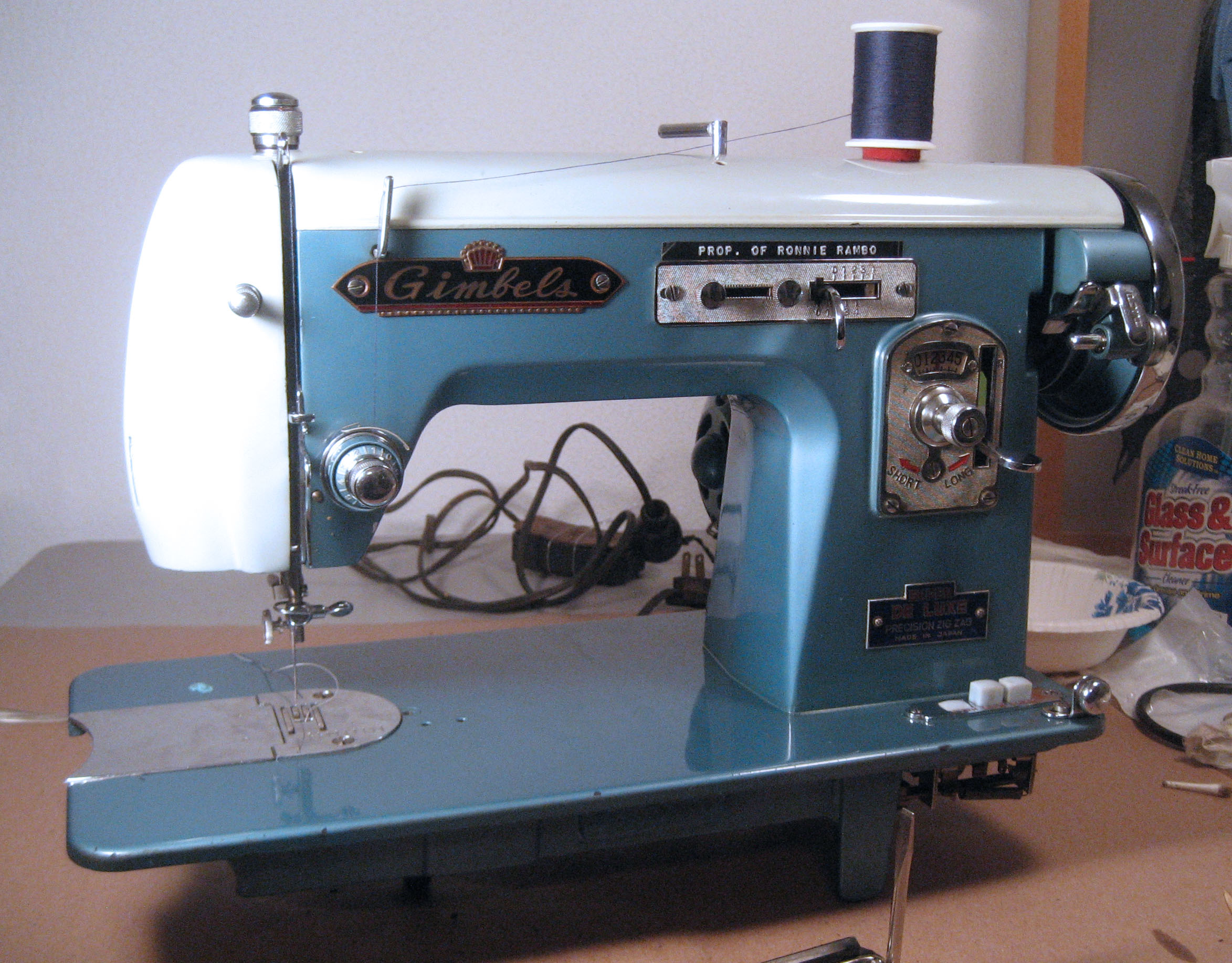
This theme is named Ronnie, after my new friend Ronnie Rambo:
 …and the code is available on Github.