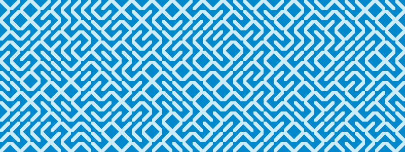
Lately I’ve been wanting to try using Spoonflower, which is a company that does print-on-demand fabric. (Like Lulu, which does POD books, you can either just print for yourself or receive commissions on sales by making your work public.) I ordered a swatch book from them, and I’m impressed with the range of fabrics and the printing.
Chris suggested that I start with the classic pattern produced by the Commodore 64 program 10 PRINT CHR$(205.5+RND(1)); : GOTO 10. You can read a lot more about this program in the book by Nick Montfort, Patsy Baudoin, John Bell, Ian Bogost, Jeremy Douglass, Mark C. Marino, Michael Mateas, Casey Reas, Mark Sample, and Noah Vawter, but the summary version is that the program prints a random choice of two Commodore-specific characters, a right-leaning diagonal and a left-leaning diagonal, which wrap and fill the screen with a lovely mazelike pattern.
Handing Spoonflower the output of the BASIC code is unlikely to go well, though; they’ll gamely accept either raster or vector images, but not text, and certainly not text in a relatively obscure encoding.
I decided I’d like to make the work in delicious, crisp vectors, and that I’d make the slash character as an SVG in Illustrator and arrange them on the page with a handful of code. To make the SVGs, I stared at some screenshots of PETSCII to guess that the characters were 8x8 pixels, with the slashes two pixels wide.
Processing is an obvious choice for manipulating images in code, and it cheerfully works with SVG input and can output vector artwork as a pdf using a built-in library. The 10 PRINT book has a chapter on Processing ports of 10 PRINT, but since I was adding in the pdf export functionality anyway, I just made my own.
This code is not quite as concise as the Commodore version, but it’s not too bad:
1 2 3 4 5 6 7 8 9 10 11 12 13 14 15 16 17 18 19 20 21 22 23 24 25 26 27 28 29 30 31 32 33 34 35 36 37 38 39 40 41 42 43 44 45 46 47 48 49 50 51 52 53 54 55 | |
The output shows tiny hairlines between the elements in Preview for me, so I pulled it into Illustrator, selected all the slashes and backslashes and ran Pathfinder->Add to Shape Area to merge them.

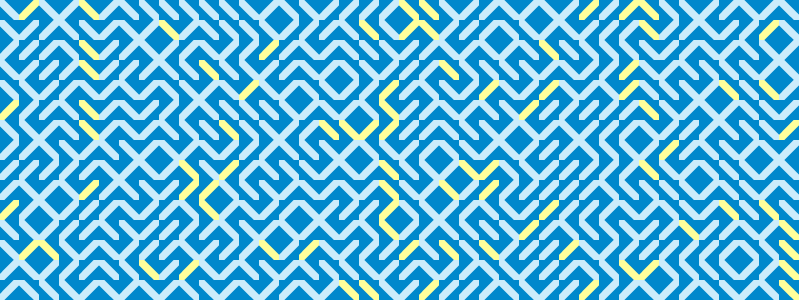
I picked the above colors based on which colors of the Spoonflower swatch guide I thought would be within my wardrobe’s palette while having good contrast; only later did I notice that they were almost the original Commodore 64 colors and thus similar to the cover of the book. I’d originally intended to go a bit more abstract, even including some random variation in the character colors, like this one where colors = {color(0,136,204), color(204,236,251), color(204,236,251), color(204,236,251), color(204,236,251), color(204,236,251), color(255,255,155)};:

But I didn’t like how the random color made the pattern less mazelike, and now I’m liking the idea of going full Commodore blue instead of the greener blue I’d originally picked out. (The swatch indicates this will print a little darker than it’s showing on my screen.)

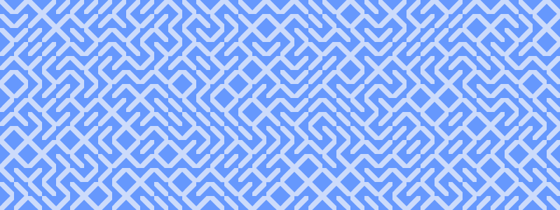
Another experiment I tried, reflected in the above code, was using a pixelated style for the slashes:
![]() I think this could be a great look if it were a woven pattern, but I prefer the cleaner lines for a print.
I think this could be a great look if it were a woven pattern, but I prefer the cleaner lines for a print.
The code and svgs for this are on Github. Next, I’ll decide on a specific project/yardage, order the fabric, and then of course actually sew something with it. If this fabric printing venture goes well, perhaps eventually I will get around to making a sundress out of the middle panel of The Garden of Earthly Delights.